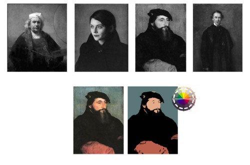
Colour Composition
Colour has three aspects: hue, value and chroma. Colour composition begins with a value scheme (lighter or darker greys), and there are eight or ten of these schemes (the disparity of the numbers is caused by the fact that the value schemes actually elide into each other, rather than being discrete; the cut-off point between schemes is not fixed). The two examples given here use what I call the Holbein Scheme and the Two-tone Silhouette.
The Holbein Scheme comprises a light-value focus (the face) that is supported by a dark base (the clothing), the dark shape of which is then designed upward to completely surround the focus. The whole of this is seen against a mid-tone background, whether plain (as here, in fig. 1) or representational.
The artist next chooses a hue scheme from the colour wheel (fig. 2). These hue schemes can be of complimentary colours, near compliments, triads, analogous colours, etc. In our example, Holbein has chosen a complimentary scheme: red-orange (the face, the low chroma dark clothing and the sleeves) and a greenish blue (the background). Please note that these schemes have nothing to do with the style in which the painting is painted: the Annigoni (top row, second from the left) and the Holbein (third from the left) are smoothly painted, while the Rembrandt (first on the left) and the Millais (at the extreme right) are very painterly indeed, but the value schemes are identical. Please note, too, that the overall value family of the mid-tone background is the main factor in defining the mood of the painting: the darker the mid-tone family, the more brooding and/or mysterious the painting.
The most mysterious of all the value compositions is, of course, the two-tone silhouette. In our example (fig. 3), we see, on the top row, a Rembrandt, a Caravaggio and a Thomas Lawrence, all essentially a number of light shapes seen against a very dark everything-else. True, there is a value range within the assembly of light shapes, but that range is nothing compared to the overwhelming contrast created by the dark “everything-else.” Caravaggio (on the bottom row) has superimposed his usual low- to middle-chroma yellow-orange to red-orange analogous hue scheme onto this two-tone value scheme.


